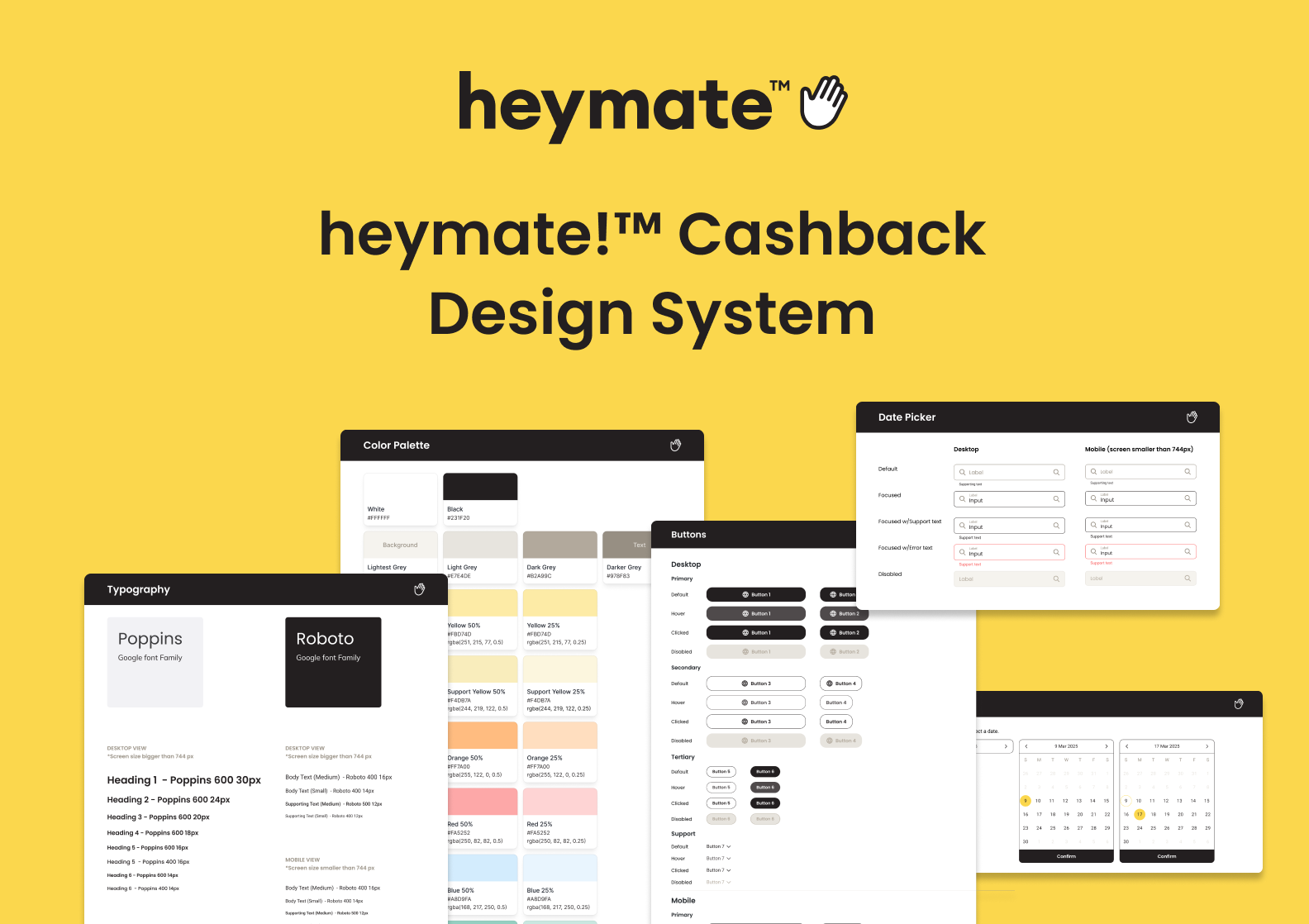
heymate!™ Cashback Design System
App & Web App | 0 to 1
Problem
“We don’t have a guide for heymate!™ cashback”
Since our team prioritized functionality over branding in the early stage, we didn’t have a design system in place. This led to confusion about which buttons, fonts, or components should be used on different pages.
Goal
Create a simple and intuitive design system to save the team time and work more efficiently.
Discovery
“How can I help developers work with the style guide efficiently?”
Without a shared system, it became difficult to communicate which components should be used where. I needed a way to help the team understand and apply design decisions consistently, without slowing down the development process.
Research
Understanding the basics
To deepen my understanding of design systems, I explored established systems like Google’s Material Design, Apple’s Human Interface Guidelines, and Bootstrap. These resources helped me grasp how a well-built system improves consistency and collaboration.
Choosing an approach
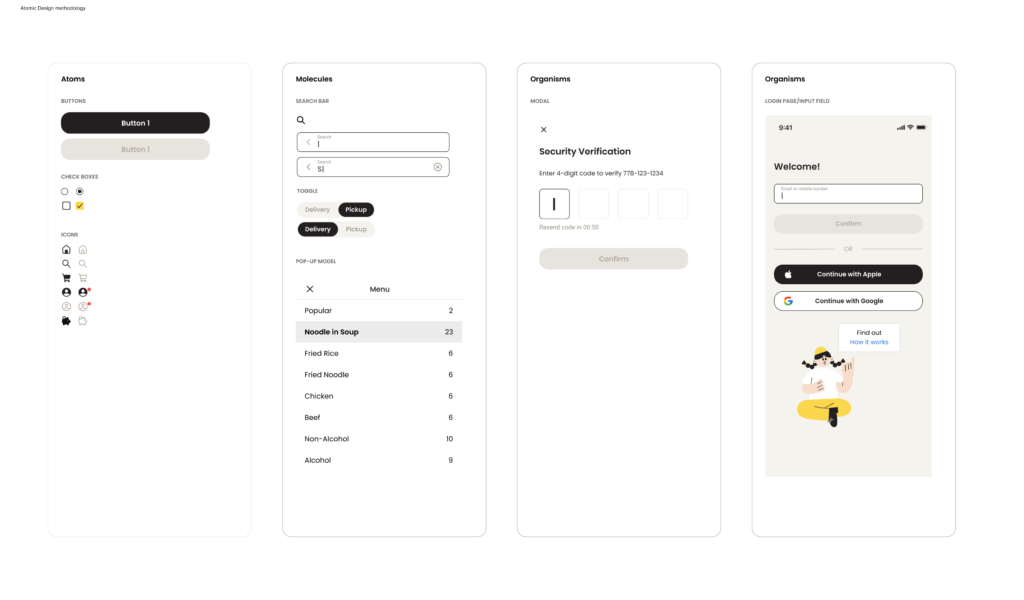
Since our product was still in its early stages, I adopted the Atomic Design methodology, beginning with the “Atoms” layer. This framework provided a scalable way to break down UI into fundamental building blocks, giving the team a foundation that could grow and adapt as the product evolved.
Define and design
Keep it simple and scalable

As the sole designer on the team, I knew even a basic set of guidelines would go a long way. I created versioned design systems (v1.1, v1.2) with foundational rules, reusable components for developers to follow.
Looking ahead, I wanted to ensure this system could grow with the team. I focused on creating flexible components by using component properties instead of building endless variants. This made it easier to customize designs without starting from scratch.
By laying this foundation, future designers can work together more efficiently and maintain visual consistency across the product.
Results & takeaway
Impact on the team
This design system became a great starting point for communication with developers. It helped reduce back-and-forth on basic design questions and saved time for everyone involved.
What’s next?
The system will continue to evolve as the product grows. I plan to add more comments to help developers follow the guidance effectively. In addition, I will iterate based on feedback, refine the documentation, and eventually scale it to support multiple designers as we expand.