
Save-on-foods
App | Case Study
Overview
Save-On-Foods is Western Canada’s online grocery store. Save-On-Foods makes it easier for customers to make healthy choices by offering a range of food, products, and services that contribute to good nutrition, health, and wellness.
In this case study, I will redesign the UI and UX of the Save-On-Foods mobile application to make it easy. Also, I will improve my user research, problem-solving, and UI design skills
Role
UX/UI Designer
Task
User Research, Problem Analysis, UX Design (User flows, Wireframes), UI Design(UI Kit, Mockups)
Design Process

Problem Analysis
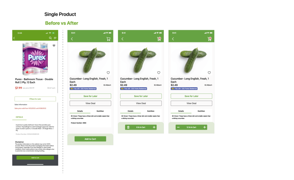
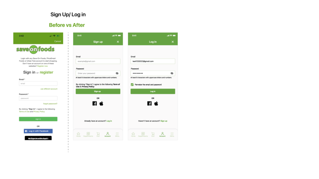
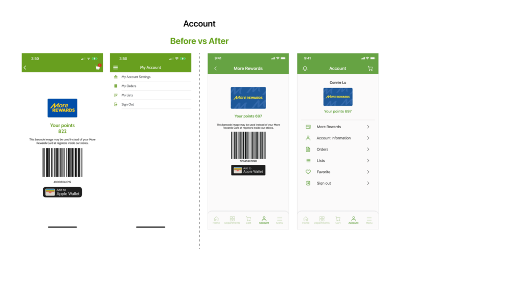
At a glance at the application, I realized it doesn’t have a navigation bar at the bottom to guide users through the app. It increases the steps for users to do online shopping on the app. I reviewed the feedback from the app store. Most users are unsatisfied with the online order for pick-up process. Also, most users care about reward points related to their accounts. Therefore, I would redesign the user flows and interface to solve the users’ problems.
- No navigation bar
- Too much information on the home page
- Icons are not significant for users to understand
- User flows are confusing for users

Redesign User Flow
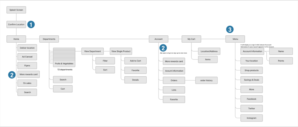
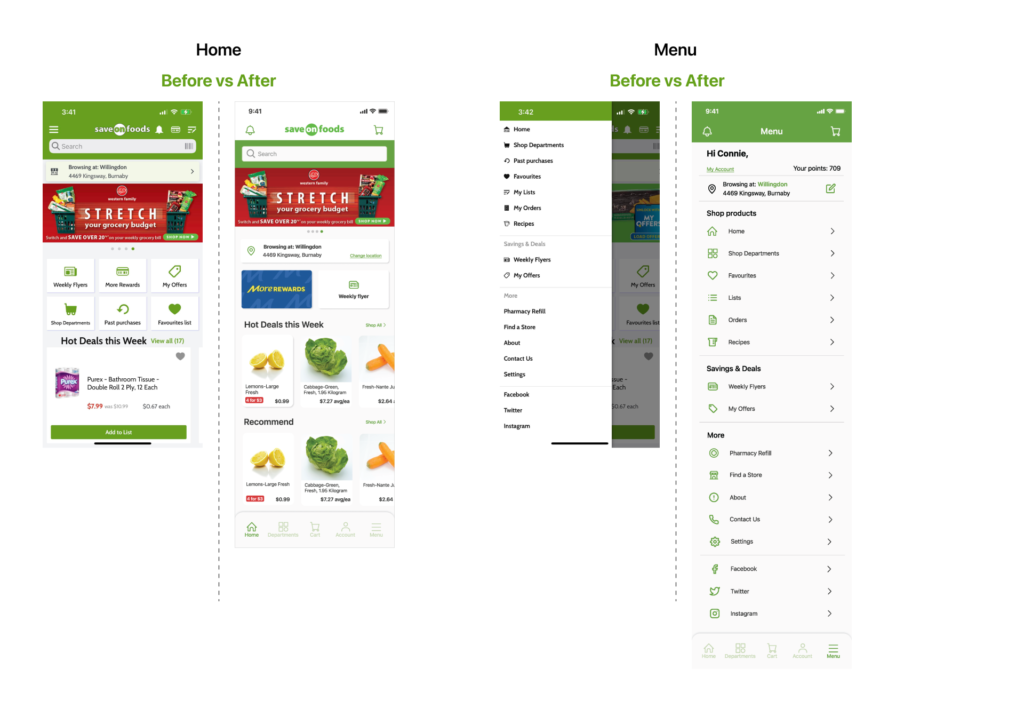
The original app doesn’t have a navigation bar to guide users, which is not a mobile app style. My primary mission was to redesign the app with a user-friendly interface to make it easy to buy groceries.
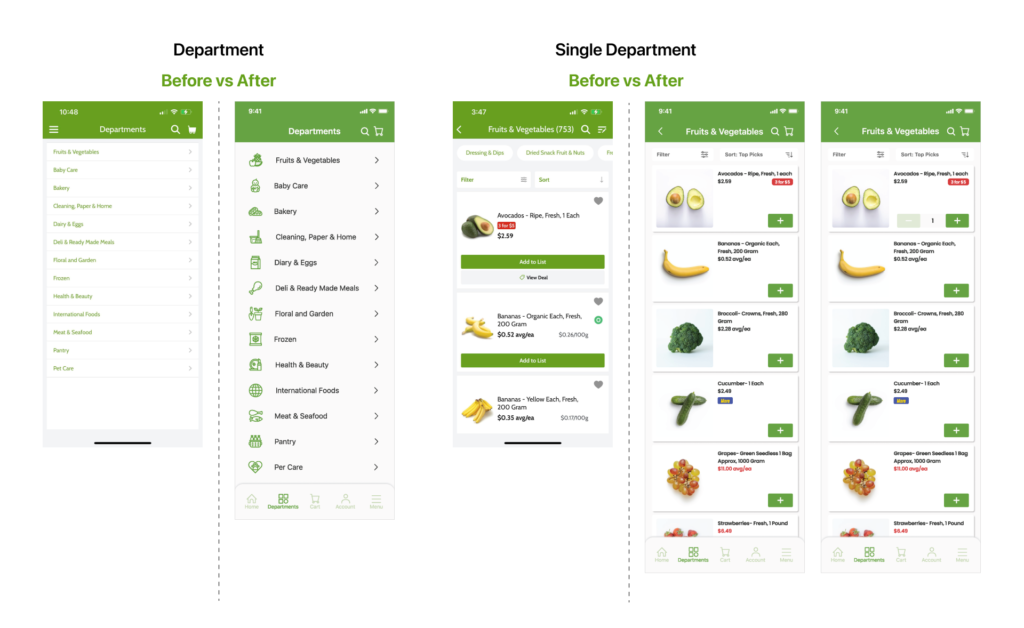
1. Because each department will have different products and deals, the app will ask users to select a location to view the updated information.
2. If users haven’t signed in, they need to sign in first to see the content.
3. I still keep the menu option on the navigation bar because the grocery app has many options and categories. Keeping the menu on the app can help users quickly find their need.
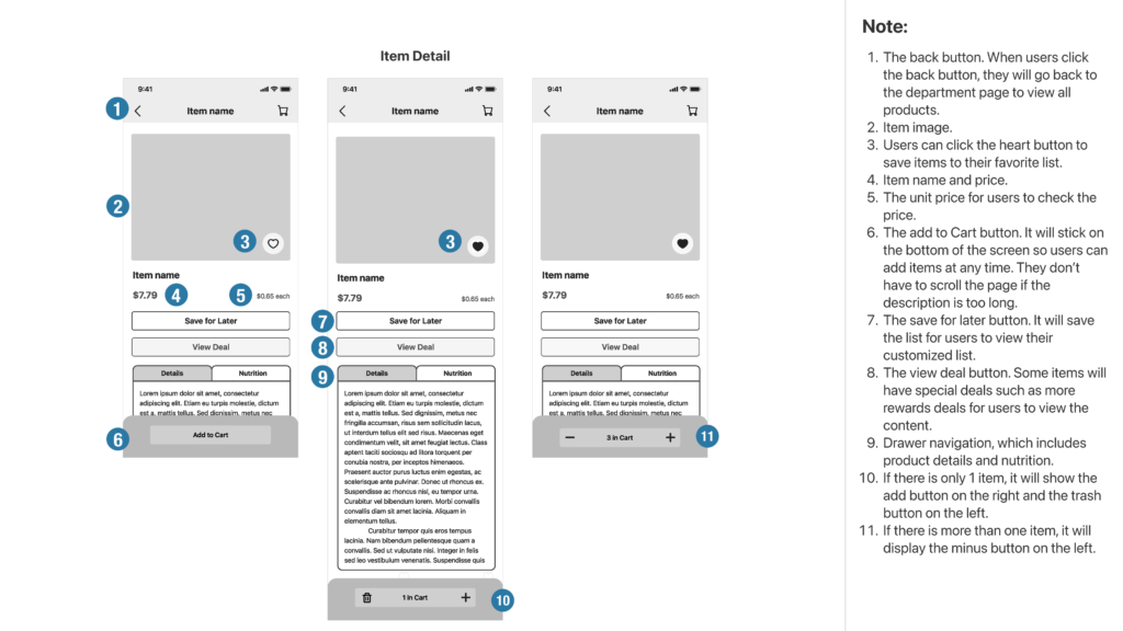
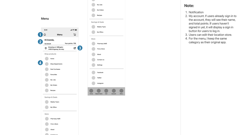
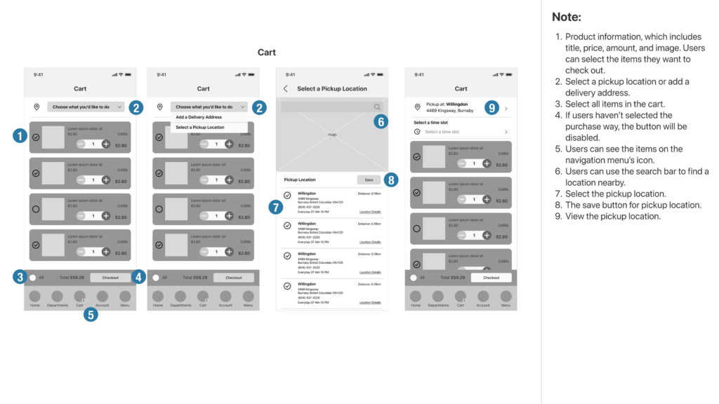
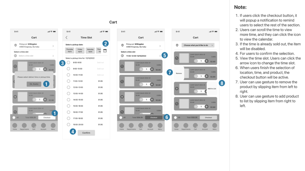
Low Fidelity Wireframe
Created concept sketches representing the skeleton of the interface. I quickly sketched the basic structures on paper before designing the wireframes on Figma to ensure the interface’s usability.

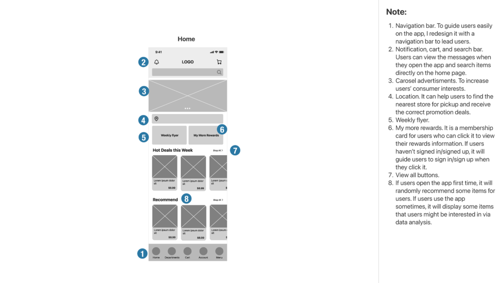
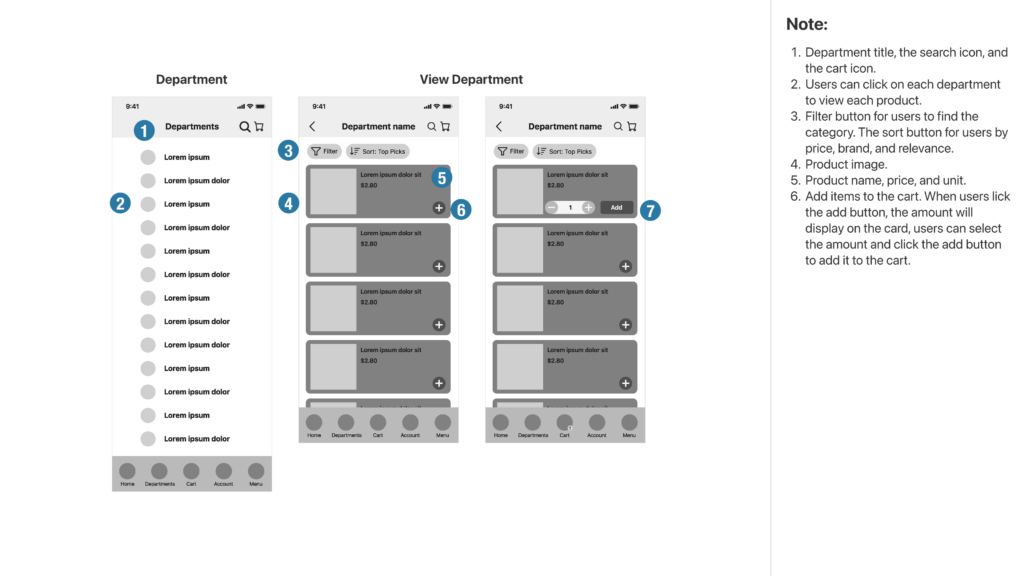
Wireframe and Note
UI Redesign
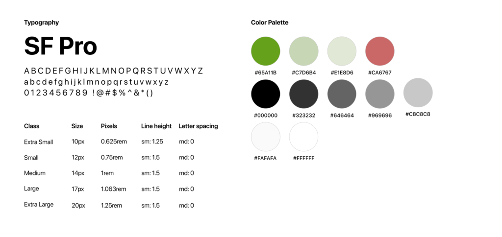
The grocery app usually has colorful content, such as images and advertisements; therefore, I choose a flat and straightforward style with dual tone color from the branding color to redesign it. I want to give users a clean interface that will not quickly fatigue eyes. Also, the line height should be added to 1.5 height for the content portion to improve readability.
Typography & Color Palette
SF Pro is a sans-serif typeface, which is neutral and has good readability.
Icon & Component
A stroke icon style with one color gives the app a minimalist style.
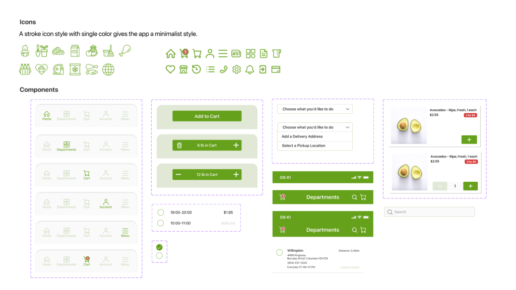
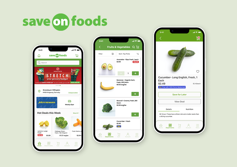
Mockup – Before vs After
Tool Used
