SHEIN
App | Case Study
Overview
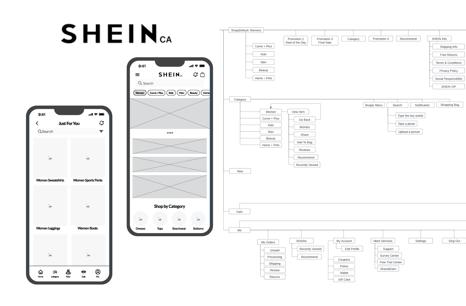
For this case study, I will focus on UX research, user flow, and wireframes. Also, I will present the original version and the redesigned version to view the difference and the improvement.
Role
UX Designer
Task
UX Research, User Analysis, User flow, Wireframes
Application Information
SHEIN is a global fashion and lifestyle e-retailer committed to making the beauty of fashion accessible to all. SHEIN provides affordable products to customers around the world, which also has many discounts and on sales marketing strategy to attract different ages customers. For now, SHEIN has reached customers in more than 150 countries.
User Analyze
SHEIN application has some UX that can be improved. First, the home page displays too much information at once. Some companies tried to provide as much as possible on the home page to have a good search on search engines or attract users. On the other hand, potential users might feel too messy to close the apps. Second, I redesign the top navigation to provide a hamburger menu for users to guide and navigate easily. When I was using the SHEIN app, I usually got lost and don’t know where can I find the information I need. From my experience and what I research about the user’s feedback, I have pointed out some main features of the app:
1. Category
2. Search Products
3. Message(Notification)
4. News
5. Gals
6. Online Customer Support
7. Checkout & Shipping
8. Wishlist
9. Recommend
10. Coupons & Points
Current User flow
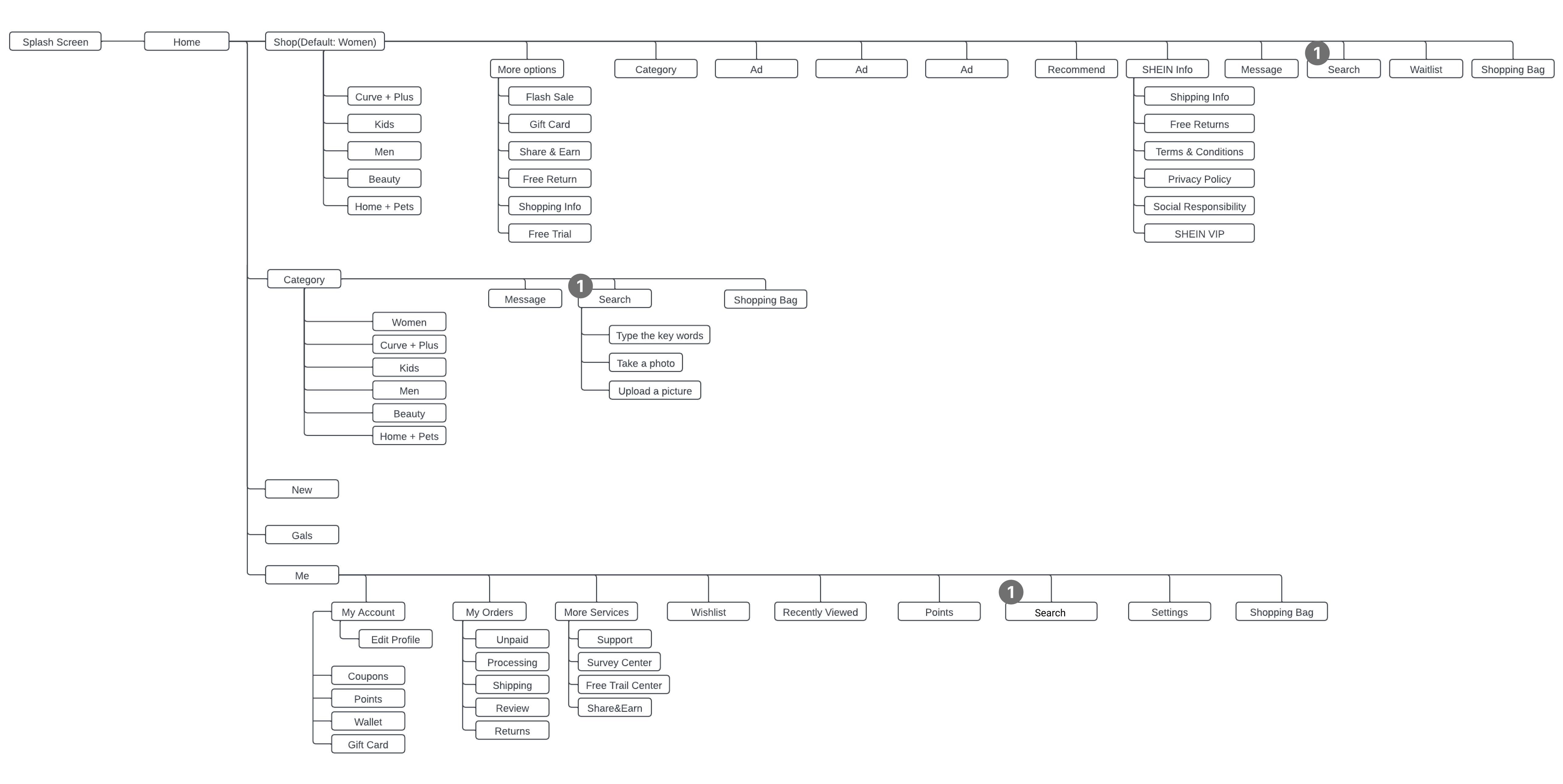
1. The top navigation bar is not consistent
Alternative User Flow
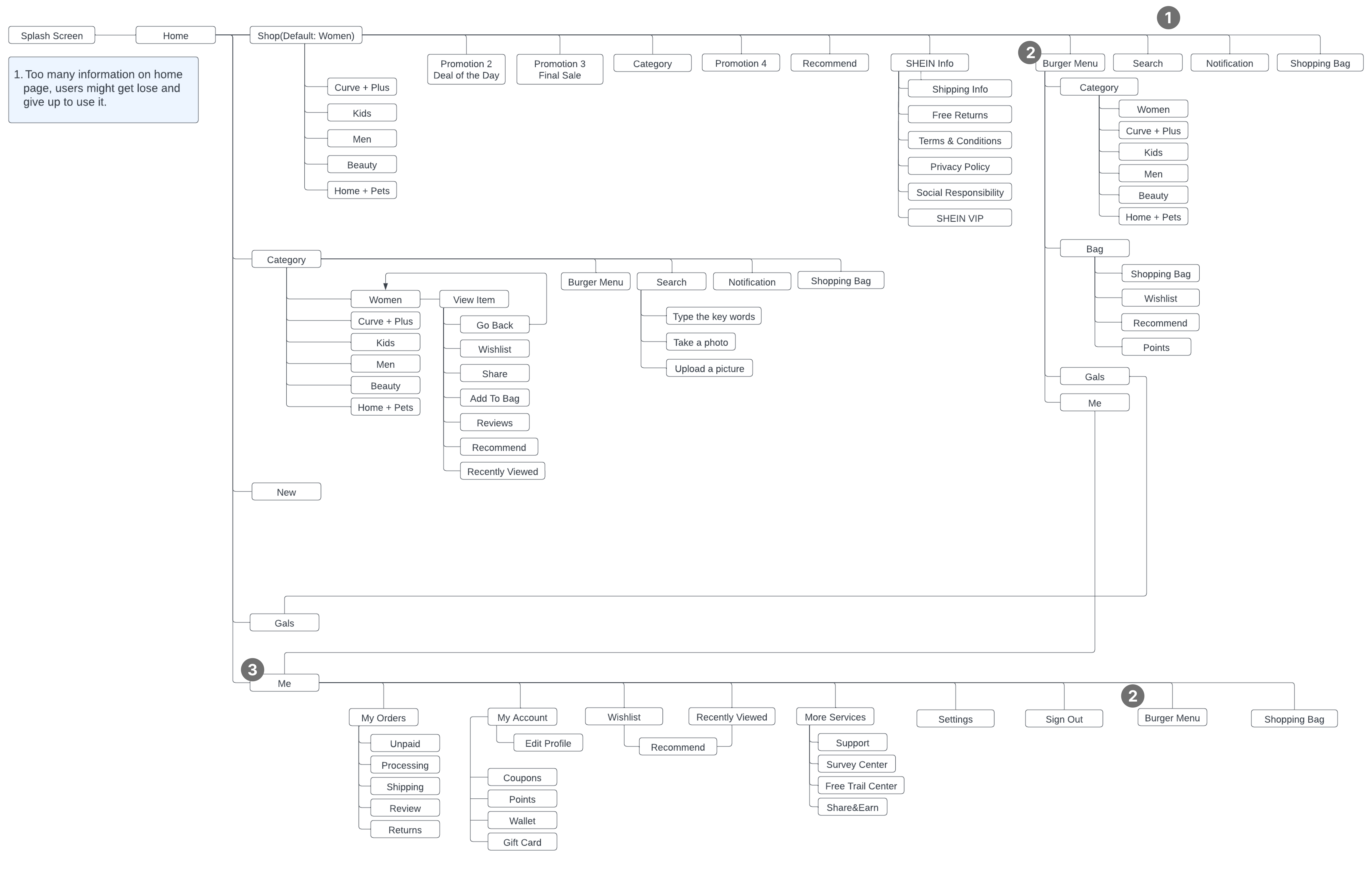
1. The top menu is not consistent in the app, therefore, I adjust all pages’ top menus to make them repeated and associated. Furthermore, this change might help users to remember the functions and buttons’ place directly.
2. I add a hamburger menu, a space-saving mechanism, for users can access the direction easily.
3. In the ‘Me’ features, I reorganize the tasks. Due to SHEIN being an e-commerce shopping app, I redesign the order of the tasks to enhance the user’s ease of checking the orders.
Design – Before vs After
Home
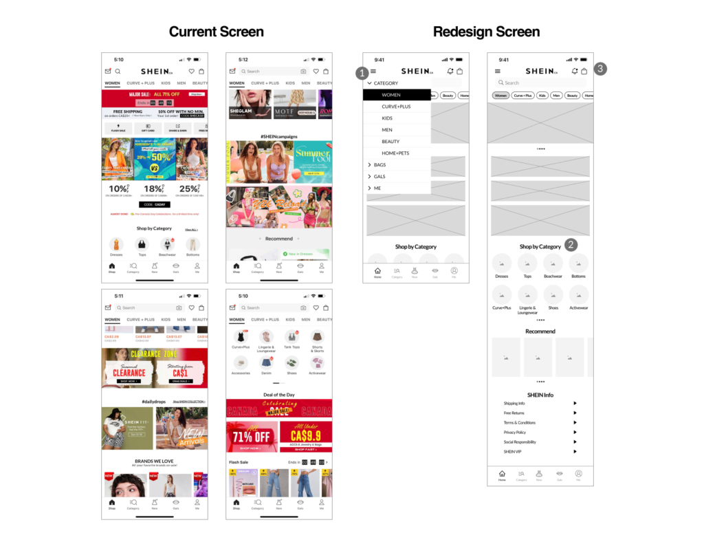
- The home page is the first screen the users will see when they open the app, I would like to make sure they had access to the main features quickly. Instead of the navigation bar at the bottom, the main feature, I also add the hamburger menu on the top-left menu to help users navigate the app.
- I kept the original layout design and adjusted it a little bit on the view more button on the category screen. I redesign it for users to swipe left to view more categories instead of clicking the view more button to open another page.
- I redesigned the top navigation which has a burger menu, I put a notification (message) on the right side to take attention to the users.
Category
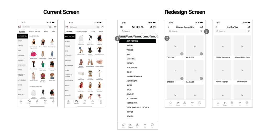
- The current category shows too much information at the same time, which would cause vision tired for users. I redesign it to display only the category on the first screen. I tried to make every page only have one action for users not to be confused by the buttons or information.
- I put all filter options in one icon to make the interface cleaner.
- The users can check their location at the top of the page.
Me
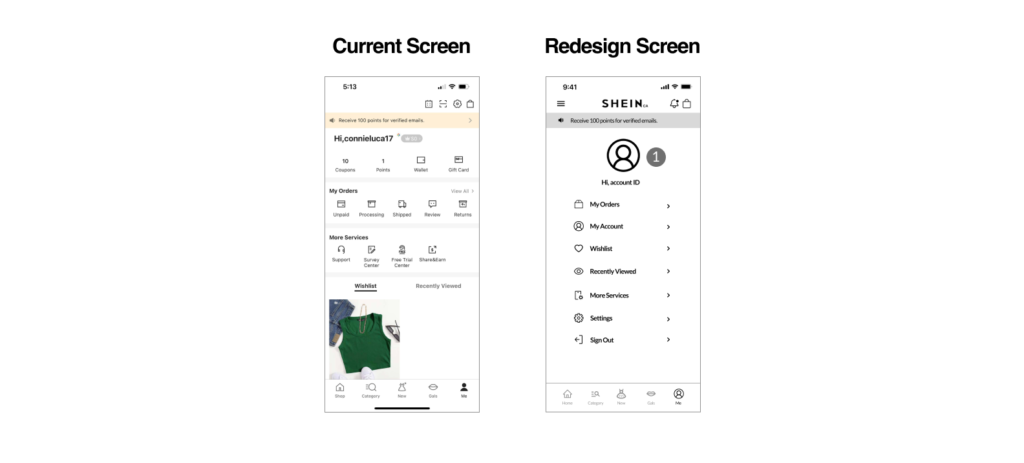
- I reorganize some features and try to focus on the main feature on the ‘Me’ screen. I hide some features into the main feature to make the interface clean and simple.
Shein Order
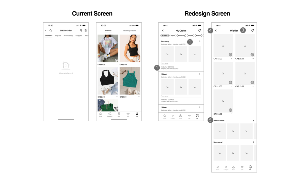
- The users can click the icon to view more detail about the orders.
- The important information will display on the first screen.
- In the top menu, I tried to guide users on all pages.
- The users can go back to the previous layer by the ‘Return’ button.
- I add the ‘Recommend’ information at the bottom of the ‘Wishlist’ page for users to view more items and keep shopping.
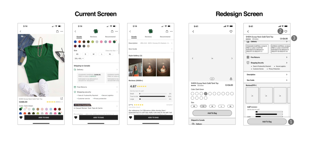
- The button ’Add to bag’ will stick at the bottom when the users scroll down to view the item details for the users to do this action at any time.
- The ‘wishlist’ icon for users to add to their list.
- The item title, price, and reviews will stick at the top. If the users click it, the page will automatically go to the top of the page.
Key Learning
Drawing insights from my research and redesign “Shein”, I’ve come to recognize the pivotal role of customer retention in driving business success. Alongside, I’ve witnessed firsthand how optimizing user experience and interface design can significantly boost transaction rates. Moving forward, my focus remains steadfast on crafting designs that prioritize user needs, ensuring seamless navigation and enhanced shopping experiences.
Tool Used

